How to create Google's Material Design Text Input Field using CSS and JavaScript?
Material Design Input Field
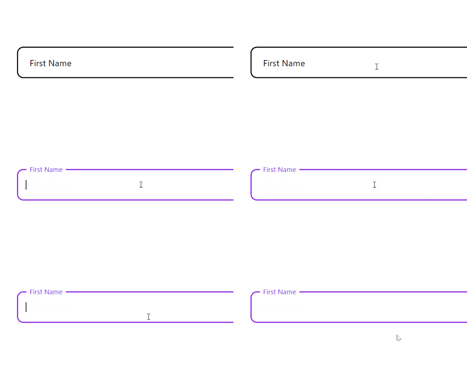
In this tutorial, we are trying to recreate Google's text input field animation and design from scratch with the help of CSS as well as JavaScript.
HTML
We are not going to use pseudo-elements to create this effect, but we will be taking help of div element instead.
We are wrapping the input element and its related divs inside a container. To create a placeholder, we have defined a separate div which will act as a placeholder rather than using the :placeholder pseudo-element.
<div class="input-contain">
  <input type="text" id="fname" name="fname" autocomplete="off" value="" aria-labelledby="placeholder-fname">
  <label class="placeholder-text" for="fname" id="placeholder-fname">
     <div class="text">First Name</div>
  </label>
</div>
CSS
First of all, let's define the properties for the input element and it's container.
.input-contain{
    position: relative;
}
input{
    height: 5rem;
    width: 40rem;
    border: 2px solid black;
    border-radius: 1rem;
}
We will be placing the placeholder text on top of the input element by setting the position of the placeholder text to absolute so that it matches the width and height of the input container.
.placeholder-text{
    position: absolute;
    top: 0;
    bottom: 0;
    left: 0;
    right: 0;
    border: 3px solid transparent;
    background-color: transparent;
    display: flex;
    align-items: center;
}
But there's an issue. You can't click on the input element because the placeholder element is on the top of the input element. In order to overcome this situation, just set the value of pointer-events to none for the placeholder element.
.placeholder-text{
    pointer-events: none;
}
Now, let's style the placeholder text a little bit.
.text{
    font-size: 1.4rem;
    padding: 0 0.5rem;
    background-color: transparent;
    color: black;
}

input, .placeholder-text{
    font-size: 1.4rem;
    padding: 0 1.2rem;
}
Next up, let's define what should happen when the input element is focused.
We are going to change the border-color rather than keeping the outline on focus event.
input:focus{
    outline: none;
    border-color: blueviolet;
}
We want the placeholder text to translate along Y-axis(to go up) and reduce it's font-size a little bit when the input element is focused. Also, we can change the color of the placeholder text. Here's how we can do that. Change the background-color to resemble the surrounding color to make it more elegant.
input:focus + .placeholder-text .text{
    background-color: white;
    font-size: 1.1rem;
    color: black;
    transform: translate(0, -170%);
    border-color: blueviolet;
    color: blueviolet;
}
For a smooth transition, add transition property to the placeholder text.
.text{
    transform: translate(0);
    transition: transform 0.15s ease-out, font-size 0.15s ease-out, background-color 0.2s ease-out, color 0.15s ease-out;
}
Up until now everything is fine, but now a problem arises. When you enter text in the input element and then remove the focus from the input element, the placeholder text comes to it's original position and we don't want that. We want the placeholder text to remain above the input text when something is already entered in the input field. Hence, we will be taking the help of JavaScript and we will modify CSS.
If you remember, we have already defined value attribute for the input element. This will come handy.
<input type="text" id="fname" name="fname" autocomplete="off" value="" aria-labelledby="placeholder-fname">
Let's modify some CSS. As already discussed, when the value is an empty string, the placeholder text should come back to its original position, but when the value is other than an empty string, the placeholder text should remain transformed(above the input text). We can achieve that by defining a :not pseudo-class on the input element value. Here's how we can do that.
input:focus + .placeholder-text .text, :not(input[value=""]) + .placeholder-text .text{
    background-color: white;
    font-size: 1.1rem;
    color: black;
    transform: translate(0, -170%);
}

input:focus + .placeholder-text .text{
    border-color: blueviolet;
    color: blueviolet;
}
But wait. The value attribute will remain the same in HTML. How can we change and set it to the string entered by the user? That's where JavaScript comes into action.
We will set the value of the value attribute to the string entered by the user just like this,
let input_element = document.querySelector("input");

input_element.addEventListener("keyup", () => {
    input_element.setAttribute("value", input_element.value);
})
That's it. You just made a modern material design text input field.
Here's the final output: